Fill Full is an e-commerce platform specialising in snack retail, designed to cater to busy professionals, families, and health-conscious individuals in Hong Kong. The website aims to provide a convenient and enjoyable shopping experience by offering a wide selection of snacks, all while focusing on user-centric design.
I was responsible for analysing data collected from Google Analytics and transforming it into actionable insights to identify design opportunities. I took charge of designing the responsive website, ensuring it delivered an intuitive and seamless experience across devices. Additionally, I prepared design materials and developed the website, ensuring the design was effectively implemented through clean and efficient code.
Due to company policy, much of my work on this project remains confidential. Feel free to reach out if you’d like to learn more.
My work encompassed everything from creating design guidelines to developing a responsive website and implementing user-centred optimisations. It went beyond UX/UI design, also incorporating data analysis and web development. The following content highlights the key features and milestones I delivered throughout the project.
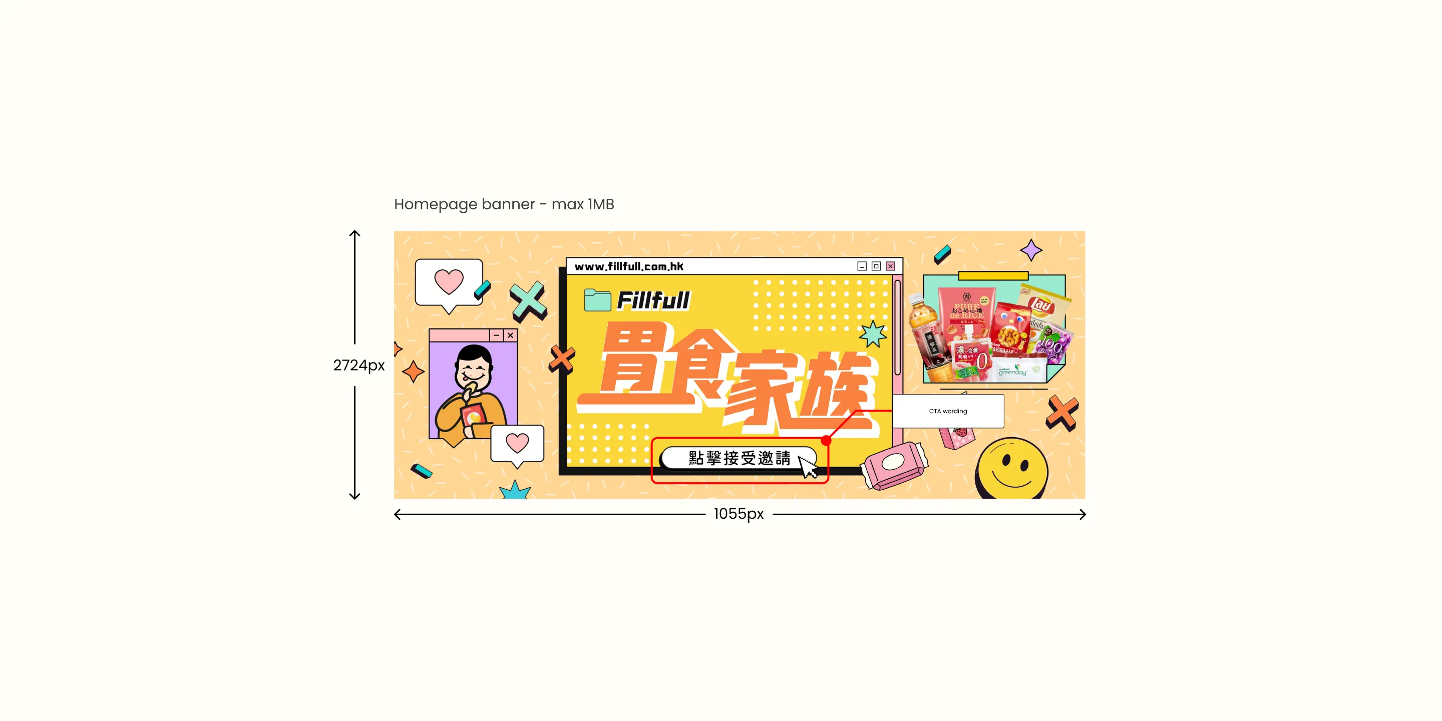
I created design guidelines for the graphic design team, making sure all marketing content was consistent and optimised for performance. I specified image dimensions, the brand style, and material sizes, so the content would not only look good but also perform well on the site.
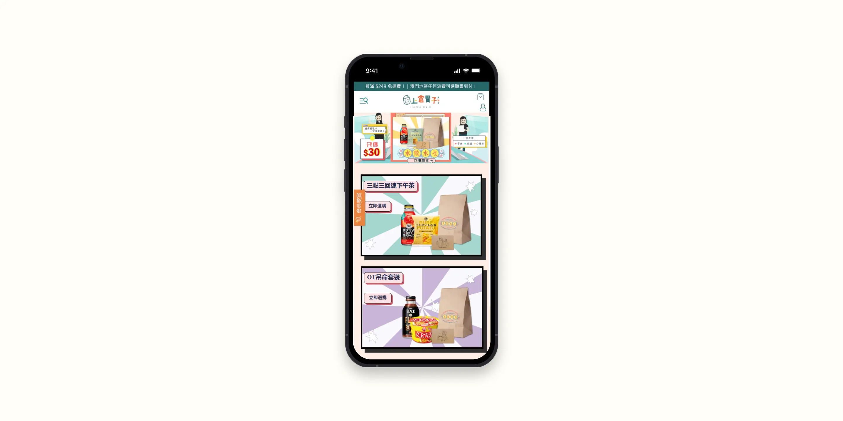
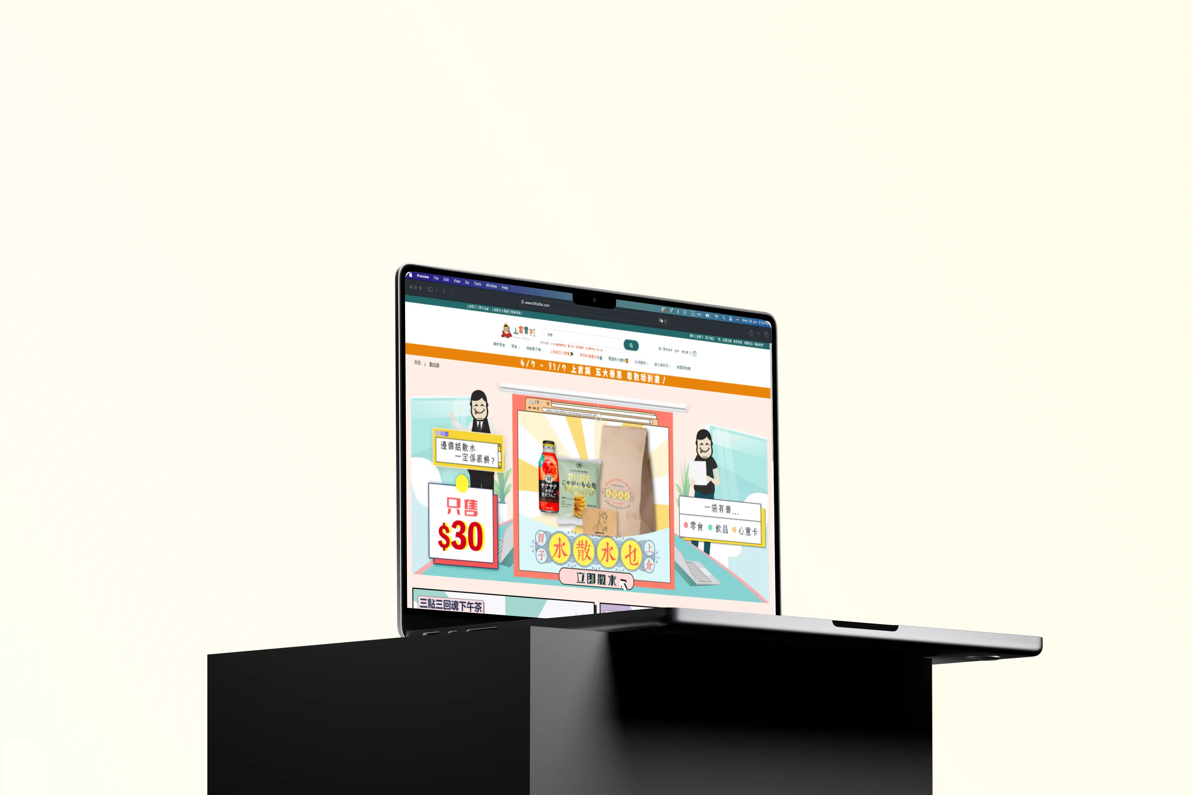
I took charge of designing and developing a fully responsive website, making sure it worked seamlessly across desktop, tablet, and mobile. This process involved fixing any UI flaws and resolving usability issues to ensure a smooth and enjoyable experience for users, no matter the device.
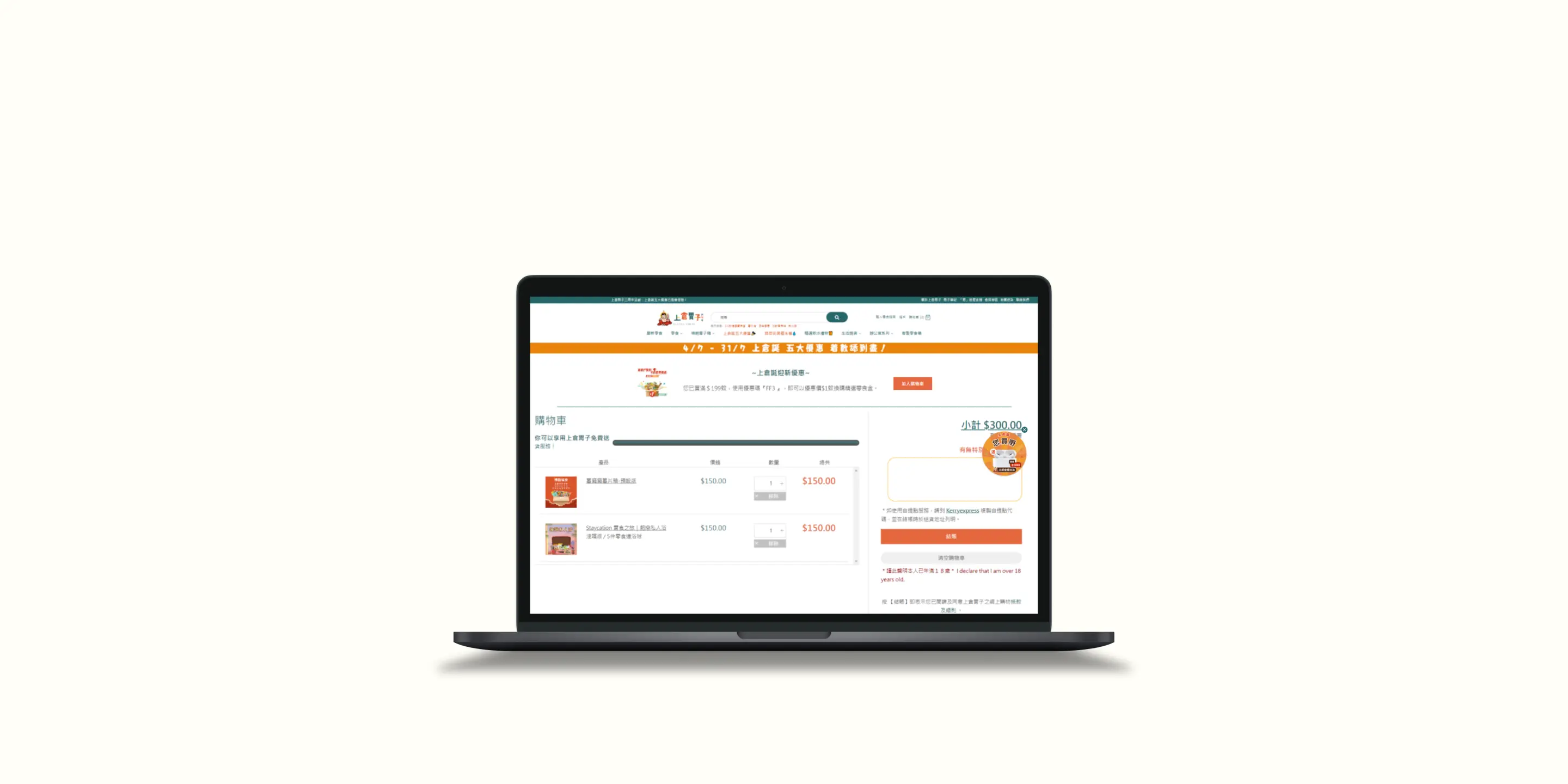
I developed a product recommendation module that suggests products based on users' browsing habits. My goal was to create a personalised experience that would help boost the conversion rate by guiding users toward products they’re most likely to be interested in.
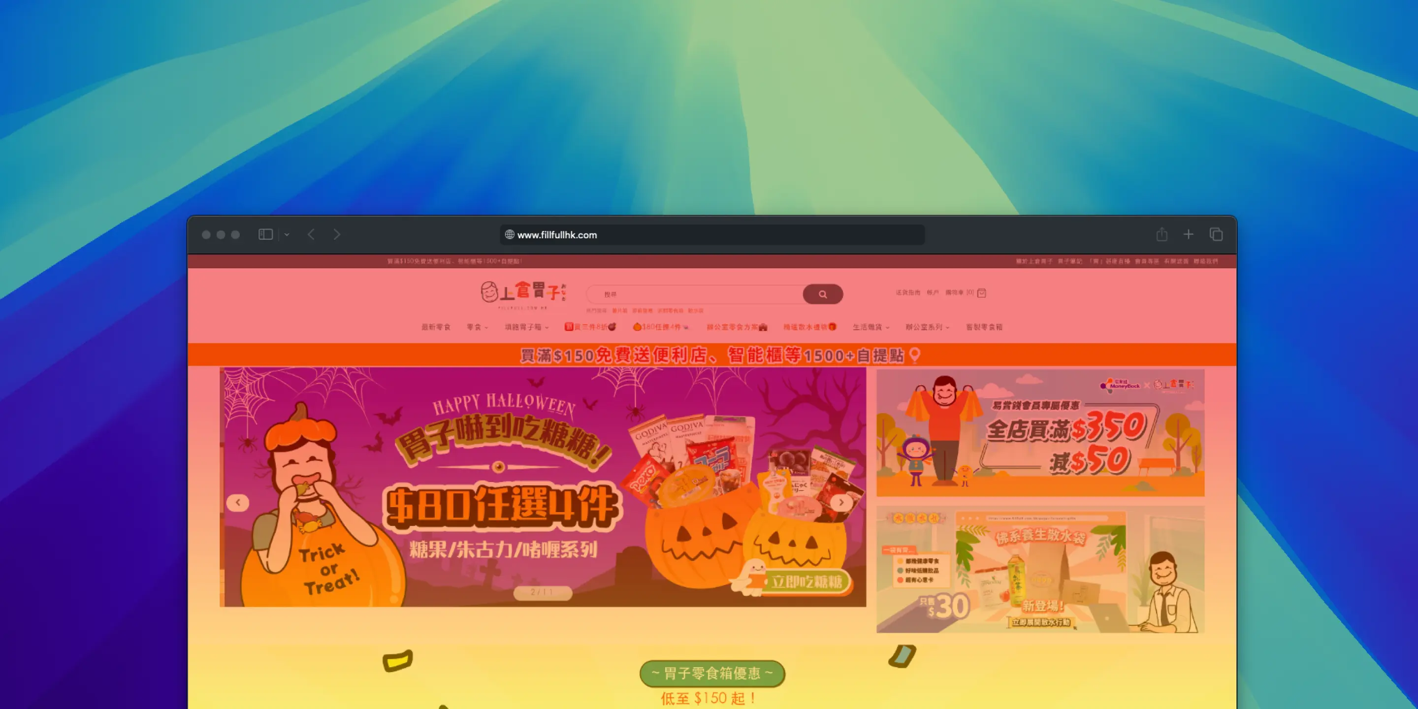
I optimised the page layout to increase product page views. Using insights from Hotjar, I analysed user behaviour and redesigned the page layout to highlight new campaigns and prompt users to engage more with the content.
Over 8 months working on this website, I contributed to several impactful changes that positively influenced the project's success. These impacts are reflected in user survey feedback, as well as data from Google Analytics and Shopify.
I designed and developed 20+ campaign pages, ensuring they aligned with the marketing team's objectives and enhanced user engagement.
According to data from Google Analytics, a 26% increase in product page views was observed. This improvement in layout indicated higher user engagement and greater interest in the content.
The website's UX improvements and the pages launched led to a 12% increase in conversion rates, according to Google Analytics. This demonstrated the effectiveness of the changes in driving user actions and enhancing overall performance.
According to the survey conducted by the marketing team, positive feedback was received from users, with 87% expressing satisfaction with the shopping experience. They specifically appreciated the personalised product recommendations, items aligned with their purchase history, and the prominent placement of promotional items and campaigns.
Throughout this project, collaboration played a key role in shaping the final outcome. I worked closely with the marketing team and graphic designers to ensure their expectations and requirements were fully understood and integrated into the design. Storytelling was an essential skill for presenting my ideas, making them more relatable and engaging for the team. Additionally, taking a data-driven approach was crucial in making the UX improvements measurable. By using data, I was able to validate my hypotheses and demonstrate the real impact of the changes, which made the process even more rewarding